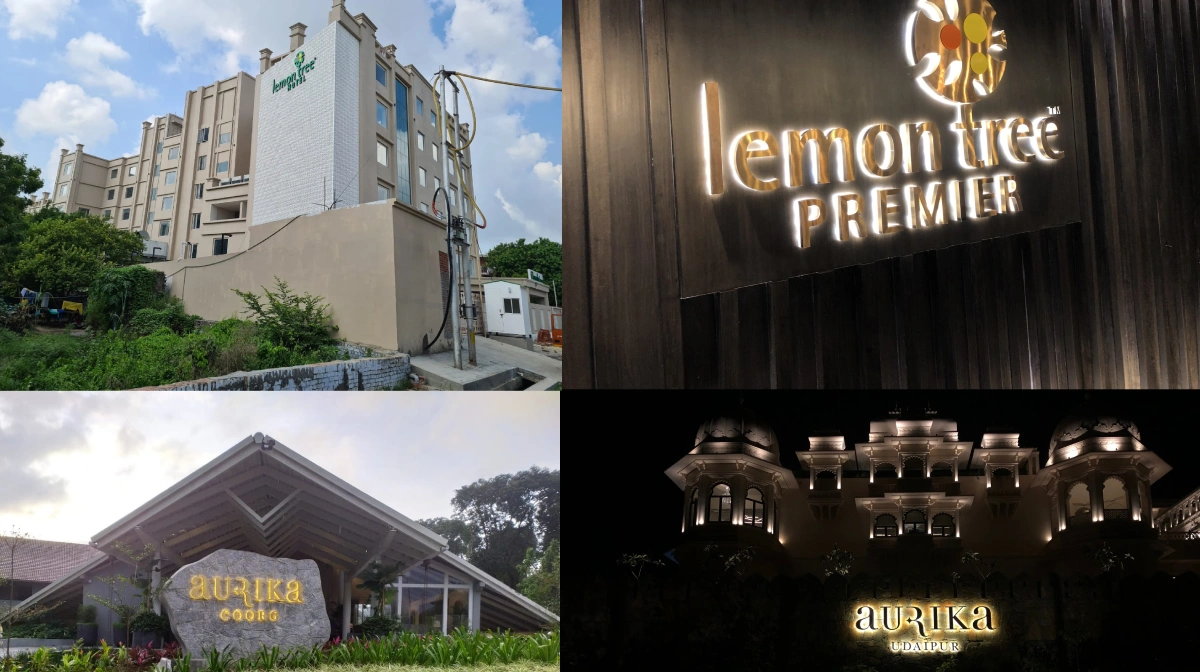
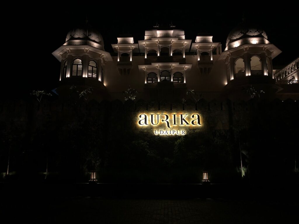
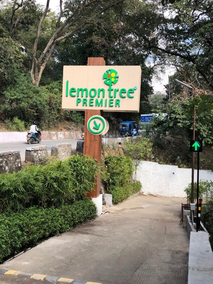
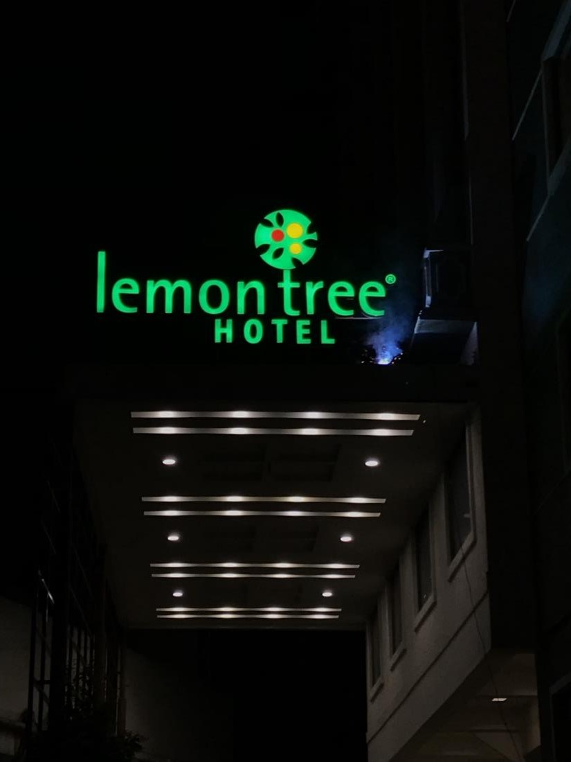
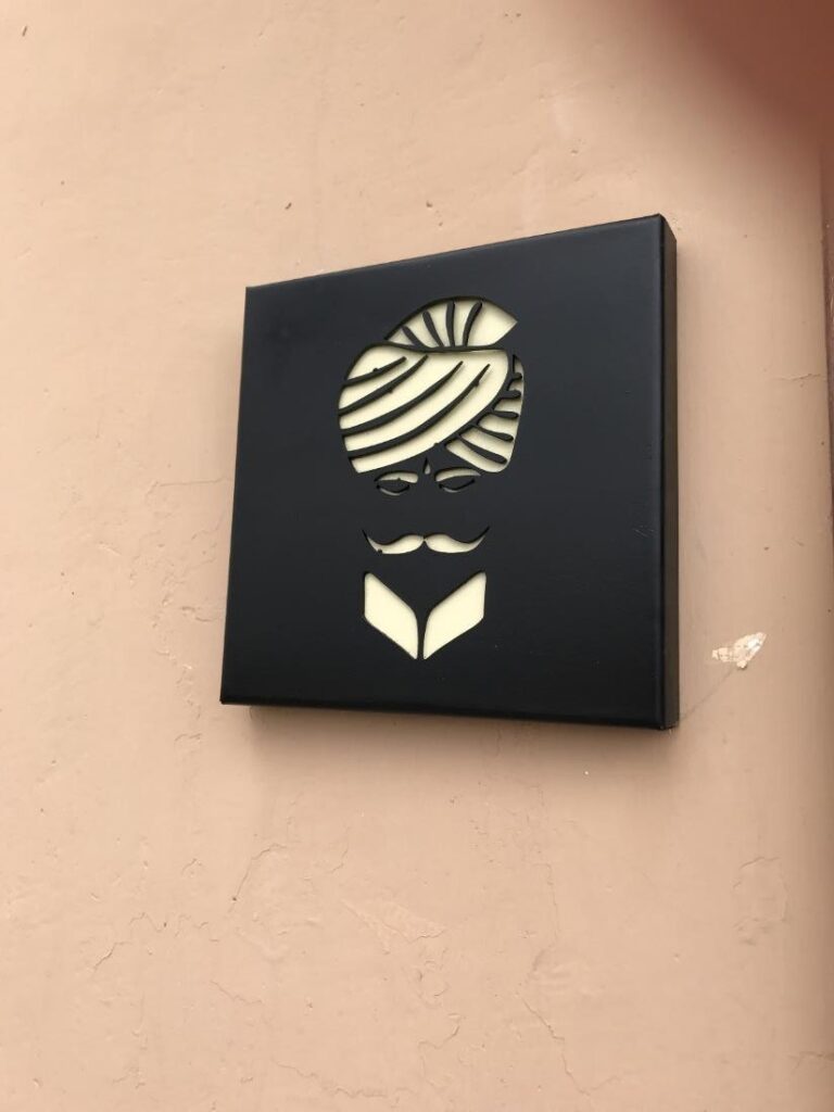
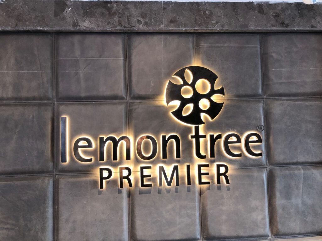
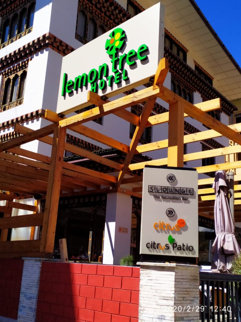
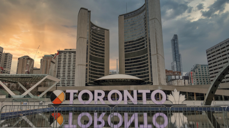
When it comes to the hospitality industry, first impressions matter. The moment a guest sets foot on your property, they begin to form opinions about their stay. Hotel signage plays a pivotal role in this process. It not only provides essential information but also sets the tone for the guest experience. In this blog, we will explore ten Hotel Signage Design Ideas that not only captivate and convert guests but also reflect the unique Canadian hospitality landscape. From embracing local influence to eco-friendly designs and seasonal themes, let’s dive into the world of Canadian hotel signage design trends.
1.
2.
3.
4.
5.
6.
7.
8.
9.
10.
Conclusion
Effective hotel signage is more than just practicality; it’s an integral part of guest engagement. In the Canadian hospitality landscape, where diversity, sustainability, and inclusivity are valued, your signage should reflect these principles. From embracing local culture to eco-friendly designs and bilingual solutions, Canadian Hotel Signage Design Ideas trends offer exciting opportunities to captivate and convert guests. By staying attuned to these trends and incorporating them into your property, you can enhance the overall guest experienc.
FAQ
Q.1.What are some creative hotel signage design trends to consider for my property?
A.1. There are several creative hotel signage design trends to consider, depending on your property’s style and target audience:
- Digital Signage: Interactive screens or digital displays can provide dynamic and engaging information, such as event listings, local attractions, or personalized messages for guests.
- Minimalistic and Modern: Clean lines, sleek fonts, and minimalist design elements create a contemporary and upscale look.
- Eco-Friendly Materials: Sustainable signage options, like bamboo, reclaimed wood, or recycled materials, align with environmental consciousness.
- Local Art Integration: Incorporate local artwork or cultural elements into your signage to create a sense of place and authenticity.
- Vintage and Retro: Nostalgic designs can evoke a sense of nostalgia and charm, appealing to certain demographics.
- Mixed Materials: Combining various materials like metal, glass, and wood can add texture and visual interest to your signage.
- Dynamic Lighting: LED lighting can make your signage pop, especially at night, creating an inviting atmosphere.
- Geometric Shapes: Experiment with unique shapes and geometrical patterns to add visual intrigue.
- Interactive Elements: Incorporating touch-sensitive or interactive elements into your signage can engage guests and provide valuable information.
Q.2.Are there eco-friendly options for hotel signage design that align with sustainability goals?
A.2. Absolutely, eco-friendly signage design is not only environmentally responsible but also aligns with the growing trend of sustainability in the hospitality industry. Consider the following options:
- Recycled Materials: Choose signage materials made from recycled content, such as recycled metal, paper, or plastic.
- Sustainable Wood: Opt for wood sourced from sustainable forests or reclaimed wood for a rustic and eco-friendly touch.
- Energy-Efficient Lighting: Use LED or solar-powered lighting for your signage, which reduces energy consumption and operating costs.
- Living Walls: Incorporate vertical gardens or living walls into your signage for a natural and eco-friendly aesthetic.
- Natural Finishes: Select water-based or low-VOC (volatile organic compounds) paints and finishes for signage that are better for indoor air quality.
- Reusable Signage: Consider signage that can be easily updated or repurposed to reduce waste and the need for frequent replacements.
- Local Sourcing: Source materials locally to reduce the carbon footprint associated with transportation.
Q.3.Could you provide examples or case studies of hotels that have successfully implemented unique signage designs?
A.3. Certainly, here are a couple of examples:
- Ace Hotel, New Orleans: The Ace Hotel in New Orleans embraces a vintage and eclectic design throughout its property. Their signage incorporates a mix of antique signs, neon lights, and hand-painted elements that capture the city’s vibrant culture and history.
- Icehotel, Sweden: Located in the Swedish village of Jukkasjärvi, the Icehotel is known for its unique and ephemeral design. Their signage includes ice sculptures with illuminated text, creating a magical and immersive experience for guests.
Q.4.How can I create bilingual signage, especially in Canada, to cater to diverse guests?
A.4. Creating effective bilingual signage in Canada is essential to accommodate both English and French-speaking guests. Here are some tips:
- Clear Layout: Ensure that the layout is clean and intuitive, with one language above the other, typically with French on top to comply with regulations.
- Font Choice: Select clear, legible fonts for both languages to ensure readability.
- Pictograms: Incorporate universally recognized pictograms or symbols to enhance comprehension, especially for non-native speakers.
- Consistent Design: Maintain a consistent design style and color scheme across both languages for a unified look.
- Compliance: Familiarize yourself with local language laws and regulations, especially in Quebec, to ensure legal compliance.
- Translation Services: Consider professional translation services to accurately convey your message in both languages.
Read Also: Navigating Brand Visibility: Insights from a Signage Company in Toronto, ON

